Meale
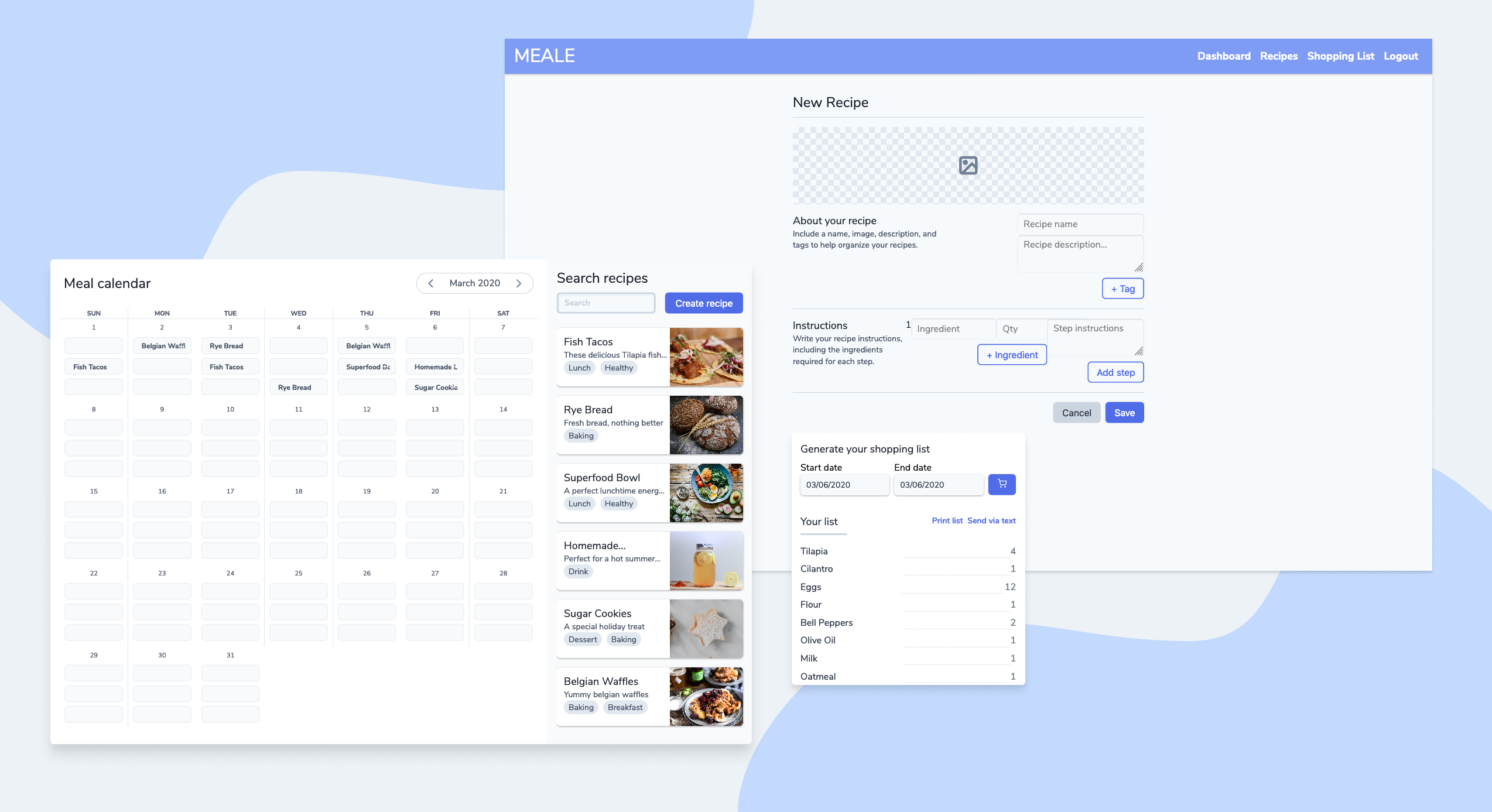
Meal Calendar and Shopping Cart generator built with React
About the app
You get home from a long day at work and the last thing you want to do is prepare a healthy, home-cooked meal. Well, DoorDash, nice to see you again.
Many people, including myself, want to eat healthier and save money by preparing their own meals. Sadly, the time it takes to find a recipe, check if you have the ingredients, run to the store to get something you’re missing, and actually get to cooking makes it too hard when compared to eating out.

Goals
I wanted to design a solution that would help busy, young professionals plan meals, organize recipes, and get all the ingredients necessary in order to save time and stick to their goals.
Existing apps help with some, but not all, of these challenges. Most meal planning apps are outdated and difficult to use. Most recipe websites are so cluttered with ads and popups, it’s impossible to actually find the fish taco recipe you’re looking for.
Process
I began talking to young professionals to learn more about their meal planning. A surprising number of those I talked to wanted to plan meals and cook more, but struggled because of the time involved. They also struggled to get the correct ingredients for the meals they wanted to make.
I used storyboards and a journey map to identify meal planning and shopping list creation as areas to focus on.
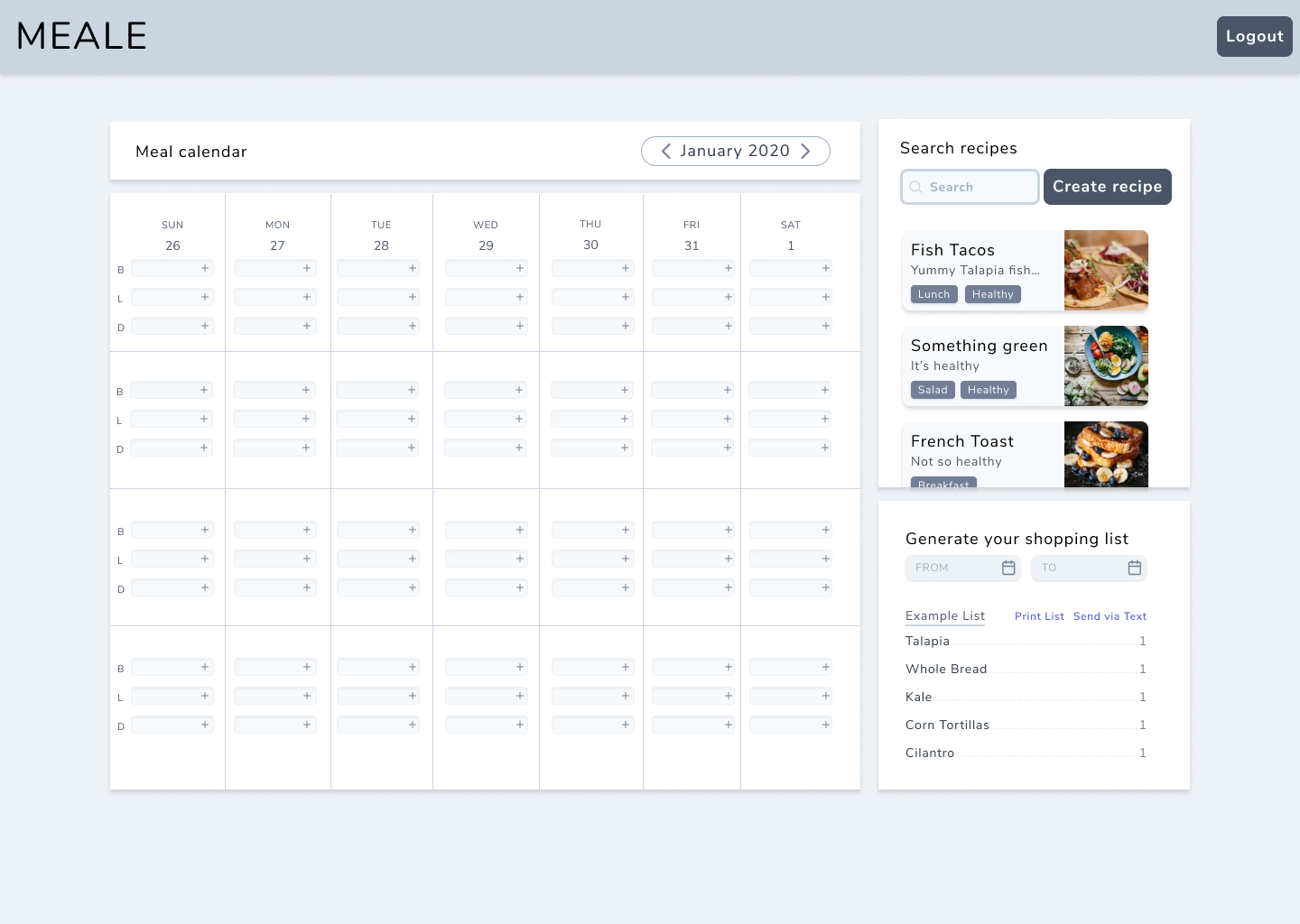
Armed with pencil and paper, I began sketching wireframes to get feedback from the people I had been interviewing. Quickly iterating, I continued to gather feedback and create colorless mockups in Figma.

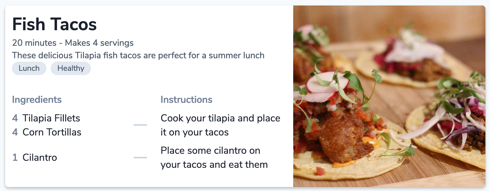
Using the prototype feature, I tested again. Most features of the app were intuitive, but adding meals to the calendar and the format of the recipes were difficult to grasp at first. Shown below, the recipe is laid out with the ingredients listed next to each step.

With those insights, I dove into building a coded prototype with React.js. I performed 5 usability tests. The biggest issue was adding meals to the calendar, which was done with drag and drop.
The interaction wasn’t intuitive or discoverable enough.
I improved this by more closely grouping the calendars and recipes and by adding the ability to type in a recipe to a slot. I also focused on cleaning up the UI.
I performed another 5 usability tests with very positive results. The new participants had an easier time navigating the app and performing key actions.
Future work
To further improve the app, I would allow editing the shopping list, allow sharing of recipes, and create simpler and more accessible ways to add recipes to the calendar.
Learnings
My workflow centered around ideation and testing saved me time and energy by exposing issues early on. In particular, I focused on and learned more about the following:
- Creating discoverable and accessible micro-interactions
- Using visual hierarchy to make actions more noticeable
- Focusing on one thing and do it well
- Testing and iterating quickly