Game checkpoints and product onboarding
A rambling comparison of game checkpoints and product onboarding best practices.
I love learning from game designers how to build great experiences. In this post, I want to explore the similarities between save systems and product onboarding.
While starting my new job at Knock.app, I set up our product in a demo app and wrote a friction log on the onboarding experience.
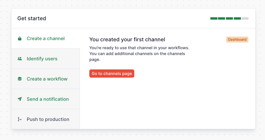
Knock is a notification infrastructure and while it makes adding notifications to an app way easier, there’s still a good amount of work to get everything set up including configuring channels, building notification workflows, and integrating our SDK into your app to identify users and trigger notifications.
The discrete steps in the onboarding flow reminded me of save systems in games, in particular of checkpoints.
Checkpoints
I’ll define a checkpoint as a game mechanic that preserves the player’s progress, giving them a point they return to after a death or defeat.
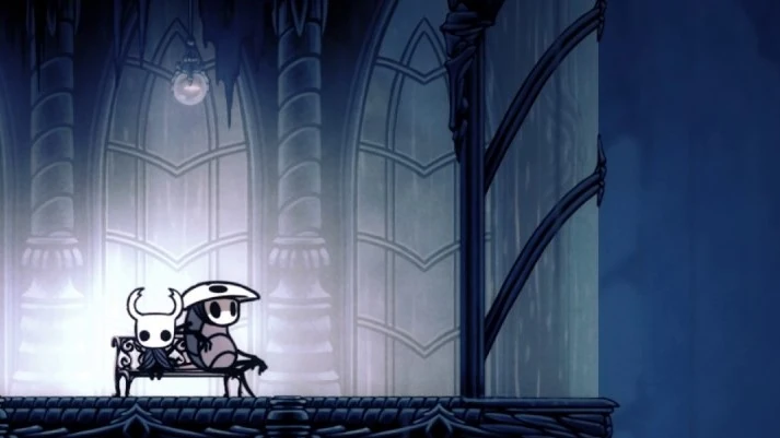
Hollow Knight, a beautiful and challenging platformer I recently beat, has two checkpointing mechanics:
- Benches to heal and save. When you die, you’ll go back to the last bench you were at
- Temporary checkpoints. If you fall off the map or onto a hazard like spikes or acid, but have masks remaining, you’ll go back to a temporary checkpoint. These are much closer together than benches

Chunking
Checkpoints give game designers an opportunity to chunk related parts of the game.
For example, many areas of Hollow Knight are themed around new mechanics or types of enemies and will include a boss fight. The common, weaker enemies will often include some of the same mechanics as the boss. That way, as the player explore the area, they can prepare for the boss fight.
The game is challenging and players often have to attempt a boss fight multiple times to succeed. Benches are place strategically so that when players have to repeat the journey from the bench to the boss fight, they get additional practice beating the common enemies.
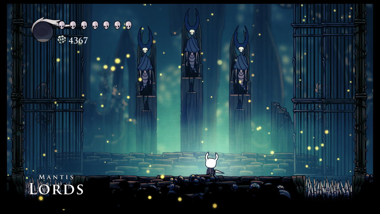
An example of this is the Mantis Lords boss fight which requires beating many easier Mantis Warriors on the way to the boss fight.

Product onboarding flows should chunk related concepts or tasks and provide natural starting and stopping points between them - they should have checkpoints. Breaking the overall onboarding experience down into discrete chunks makes it much more manageable.
The chunk should have a clear ‘save point’ where the user knows they’ve finished that chunk. If implemented well, this gives them a sense of accomplishment - they’ve finished something, they’ve experienced a win!
Chunks also reduces the mental burden required with onboarding. Instead of juggling 5 concepts at once in their mind, it’s clear to the user they’re focused on ‘Concept A’, and when they’re done with that, can focus on the next chunk.
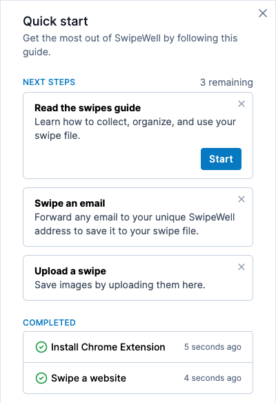
One idea for adding checkpoints to an onboarding flow is having a wizard or checklist that makes it very clear what the steps are and what progress the user has made.


Conclusion
Although it’s not a perfect analogy, I think it’s fun to consider the similarities between game design and product design.
In particular, both require designing great onboarding flows so that players or users stay motivated and engaged with the experience. Providing checkpoints can make the experience more approachable, increasing the likelihood the player or user succeeds.